street safety challenge
Open Data Discourse ran a pretty neat contest a couple months ago. They provided access to the bike accident data in the city of Cambridge, MA spanning 2010-2013, and basically said: analyze it and come up with something cool visually.
I submitted this (takes few secs to load)
We average 4.4 (reported) bike accidents per day. SO yeah, It is a real problem. Open Data Discourse did not receive my submission before picking a winner (damn you Gmail). It was a fun exercise nonetheless.
I used 50 k-means clusters, a series of PostGIS functions (including an awesome Tiger geocoder), geospatial data from the City of Cambridge. Combined with the best graphical capabilities of OmniGraffle, I basically made recommendations for sign placement (a la 'hot spots'). More info here.
My work was shown in Cambridge City Hall after the contest and I remain in touch with open data folks. I think I'm a Open Data Discourse 'Fellow' now which sounds really cool.
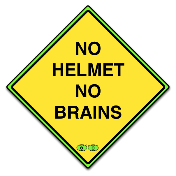
My favorite sign was:

What I learned: PostGIS is light years better than it was 8 years ago. Leaflet.js is neat and effective. If there are monetary implications, always follow-up to make sure people got your email.
Previous Post Next Post